By Matt Rappa, Sports Talk Philly editor
For the first time since 1992 — and the 16th time in franchise history — the Philadelphia Phillies have a new primary logo.
🚨👀 #Phillies new logo 👀🚨 Men’s and ladies tees featuring the new Phils’ primary logo available today, only at the ballpark. You likey? pic.twitter.com/UrCoAjY93K
— @PhilliesMCS (@PhilliesMCS) December 7, 2018
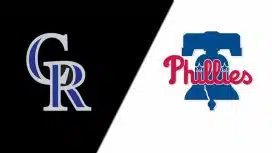
The club's Majestic Clubhouse Store tweeted on Friday an "unboxing" reveal of the new logo, which keeps the same font/script and bell background. However the underlying, red-outlined blue diamond has been removed, and the slightly redesigned bell in the new logo went from white to dark blue, with a white outline.
The Phillies are the second team in baseball and the National League East to unveil a new primary logo this offseason, the other being the Miami Marlins.
Clearly, the Phillies not only want a reworked, postseason-contending roster in 2019 — potentially made possible through acquiring superstar free agent talent — they also wanted a refreshed primary logo. The former primary logo (seen left) was introduced in 1992, the season before the club won the National League pennant.
The Phillies hope for a similar, if not expedited timeline with their new primary logo for 2019.
